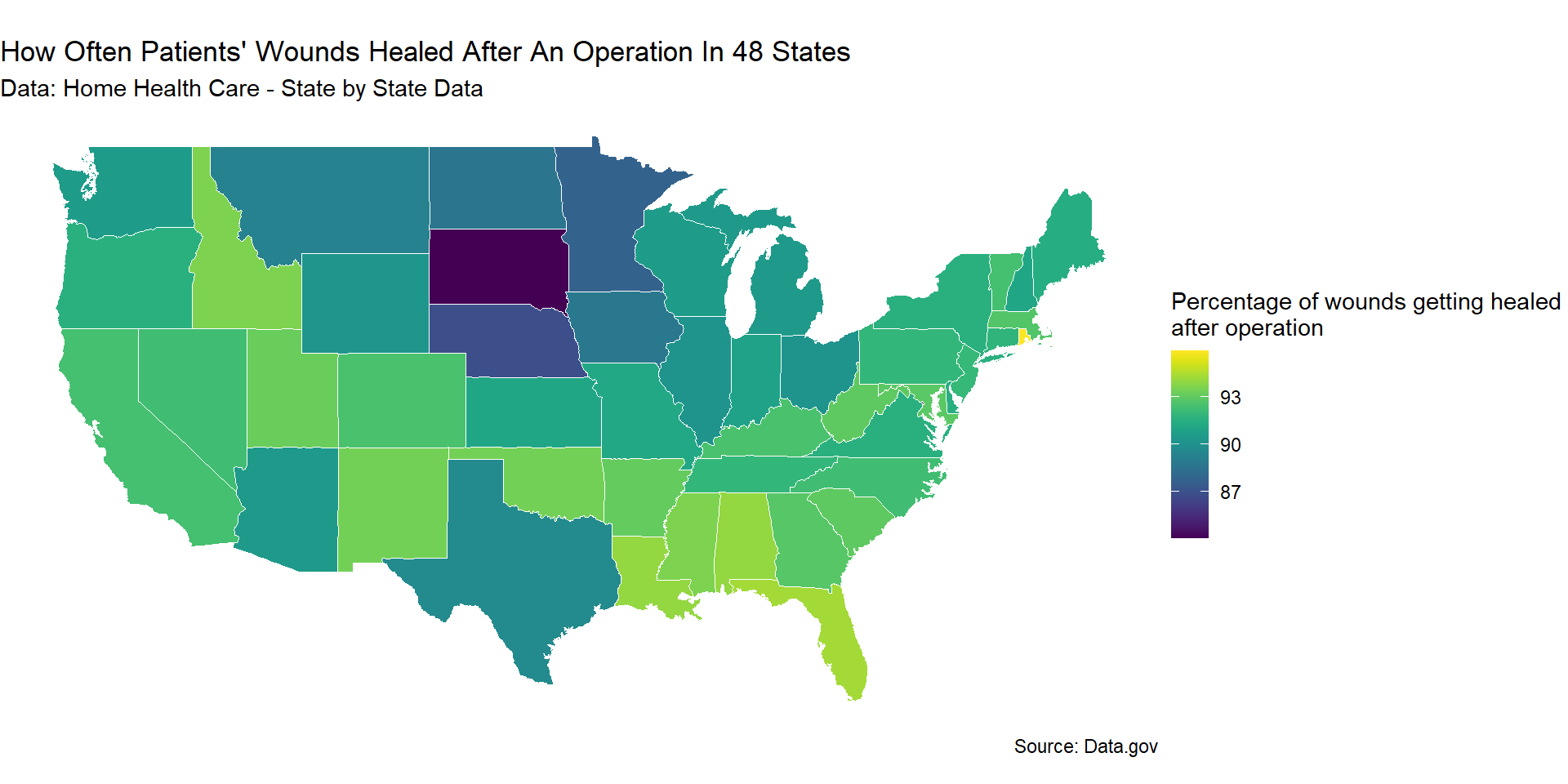
us_data <-map_data("state")home_health_care <-read.csv("dataset/health.csv")home_health_care |>drop_na(Quality.of.Patient.Care.Star.Rating) |>mutate(State =str_to_lower(abbr2state(State))) |>filter(!is.na(State), !State %in%c("district of columbia","alaska","hawaii")) |>right_join(us_data,by =c("State"="region")) |>ggplot(mapping =aes(x = long, y = lat, group = group)) +geom_polygon(aes(fill = How.often.patients..wounds.improved.or.healed.after.an.operation),linewidth=0.3,color="white") +labs(fill ="Percentage of wounds getting healed \nafter operation", title="How Often Patients' Wounds Healed After An Operation In 48 States", subtitle="Data: Home Health Care - State by State Data",caption ="Source: Data.gov") +coord_map() +theme(plot.title =element_text(size =30)) +theme_void() +scale_fill_viridis()
In the plot, the more yellowish shade each state has, the higher the average percentage of wounds healed after operation. Therefore, South Dakota is the state with the lowest percentage of healed wounds (<87%) while Rhode Island is the highest (>93%). The states in the Northeastern and South East regions tend to have higher percentage of healing than the other regions of the country. This plot can provide valuable insights into the healthcare quality of each state. However, we need to carefully consider various factors beyond the raw averages to accurately assess and compare healthcare quality between states since each state has different population demographics as well as patients’ access to healthcare services and how frequently individuals utilize these services can impact healing rates. Therefore, while state averages for wound healing after operations provide an important snapshot of healthcare outcomes of each state, they should be interpreted within the broader context of demographic, socioeconomic, policy, and healthcare system factors.
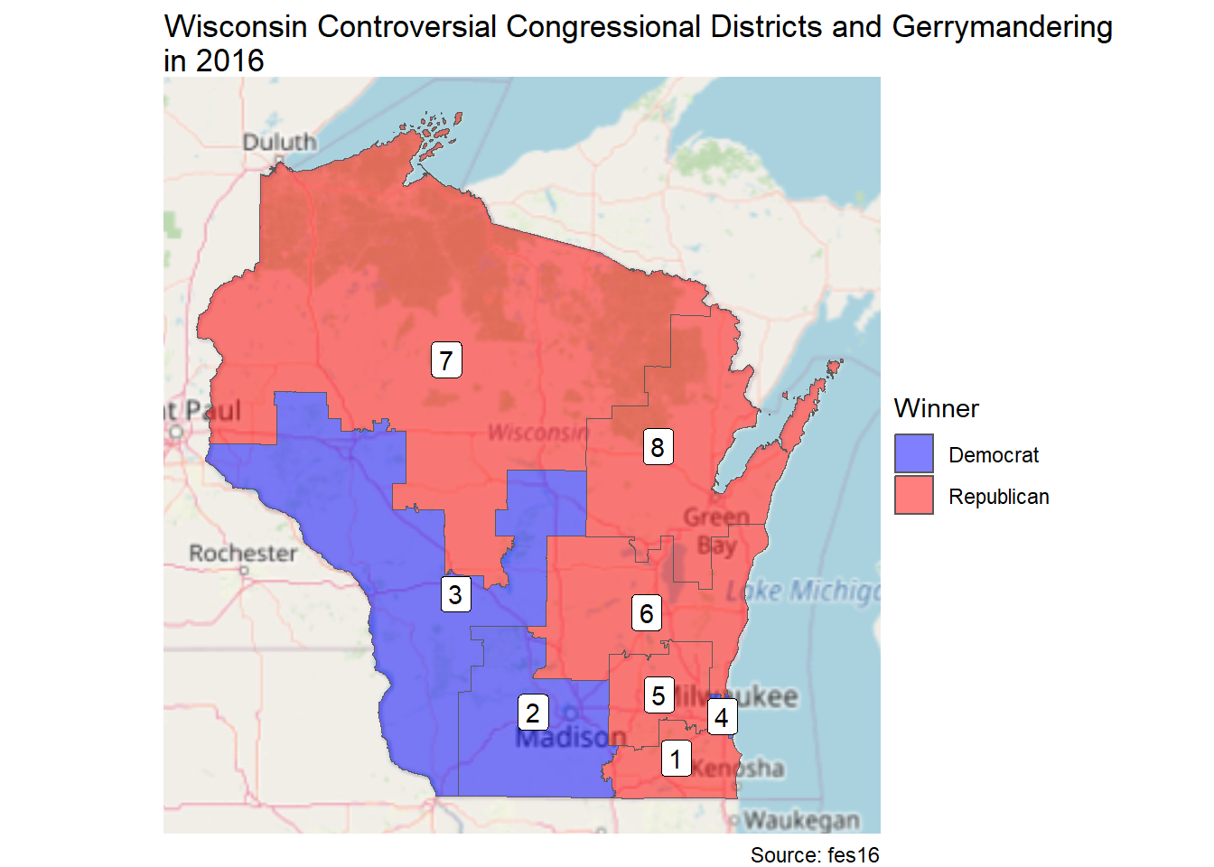
Wisconsin Districts
Warning: package 'sf' was built under R version 4.3.3
wi <-ggplot(data = wi_merged, aes(fill = winner)) +annotation_map_tile(zoom =6, type ="osm", progress ="none") +geom_sf(alpha =0.5) +scale_fill_manual("Winner", values =c("blue", "red")) +geom_sf_label(aes(label = DISTRICT), fill ="white") +theme_void()wi +labs(fill ="Winner Party", title="Wisconsin Controversial Congressional Districts and Gerrymandering\nin 2016", caption ="Source: fes16")
Warning in st_point_on_surface.sfc(sf::st_zm(x)): st_point_on_surface may not
give correct results for longitude/latitude data
wi +aes(fill = r_prop) +scale_fill_distiller("Proportion\nRepublican", palette ="RdBu", limits =c(0, 0.7) )+labs(title="Proportion of Republican Votes in Wisconsin Congressional Districts", subtitle ="In 2016", caption ="Source: fes16")
Warning in st_point_on_surface.sfc(sf::st_zm(x)): st_point_on_surface may not
give correct results for longitude/latitude data
For the choropleth map, the district 4 has color blue.
pal <-colorNumeric(palette ="RdYlBu", domain =c(0, 1))leaflet_wi <-leaflet(wi_merged) |>addTiles() |>addPolygons(weight =1, fillOpacity =0.7, fillColor =~ifelse(r_prop > d_prop, "red", "blue"), color ="white",popup =~paste("District ", DISTRICT, "</br>", "Probability of Republic Votes: ", round(r_prop, 4),"</br>", "Probability of Democratic Votes: ", round(d_prop, 4), "</br>Total votes: ", wi_results$total_votes) ) |>setView(lng =-90, lat =45, zoom =7)leaflet_wi
Clicking on a district will show the probability of Republican and Democratic votes of that district.
In 2016, most of the districts in Wisconsin’s winner was Republic (6/8), except for District 2,3, and 4. In District 3 and District 4, there are no votes for Republican party. The ratio of probability of votes between the winner and the opponent party of most district is about 2:1. According to the plot, I assume that the winner party is Republican Party since it won more districts.